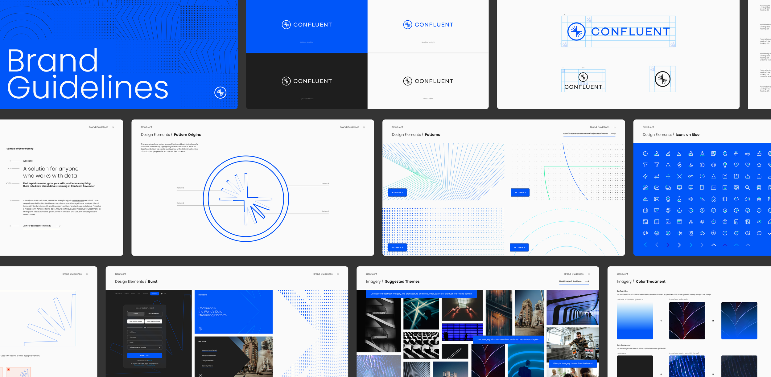
BRAND IDENTITY • DESIGN SYSTEMSA brand system designed for data in motion
TIMELINE 3+ MONTHS • COMPANY SIZE 3,000+ • tech industryConfluent, the world’s data streaming platform, needed a brand refresh that reflected their position as an industry leader. Operating in a highly technical space, the brand needed to be able to express complex ideas without feeling unapproachable or dumbed down. It also needed to power multiple touch-points without losing consistency or impact.
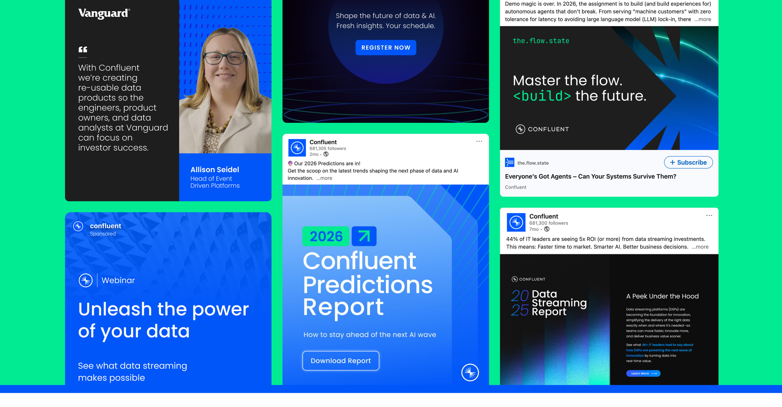
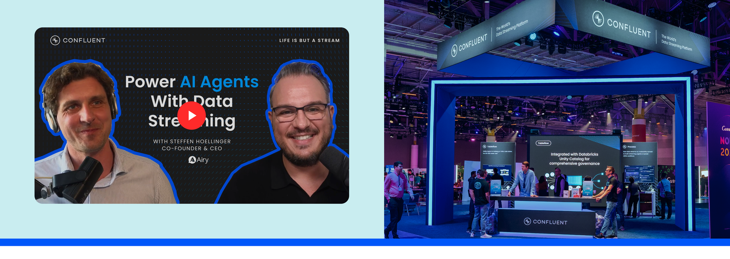
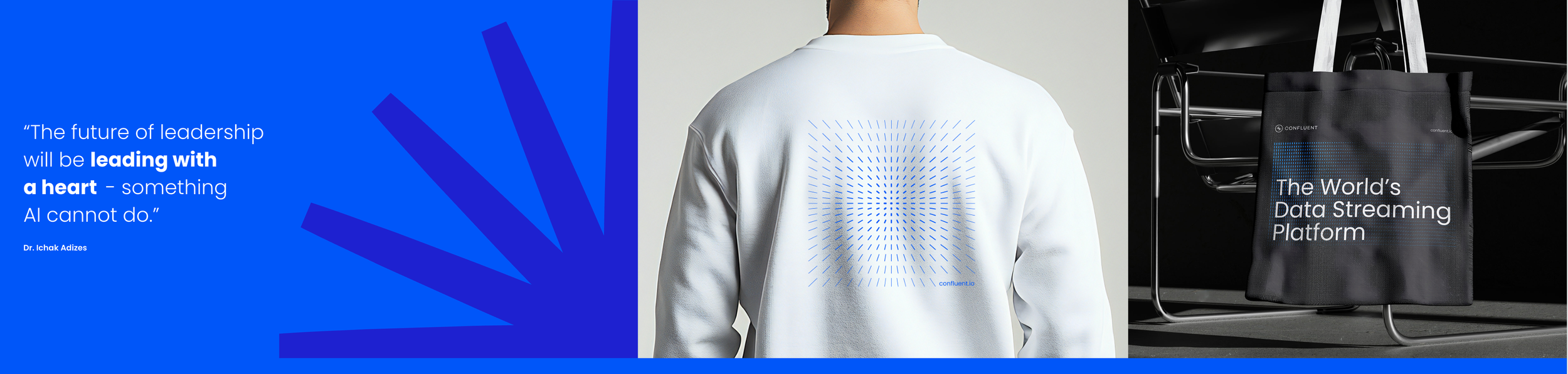
The solution was creating a high impact, high contrast visual system to bring real-time data to real life. A core geometric language of patterns and motion are rooted in product functionality and highlight the core brand value of acceleration. Bold colors, clean typography and modular layouts stand up to technical information without muddying it. Unexpected motion and architecture in lifestyle photography give real-world context to Confluent’s data solutions for customers.
key RESULTs OF THE BRAND REFRESH: 200%
increase in pipeline generation for webinars from designed content
176%
increase in registration targets for webinars from designed paid ads
33%
increase in total watch time share on YouTube from refreshed thumbnails
152%
increase in downloads for
trend reports
Core Brand
Elements
One of the main issues we ran into was “how do we portray the core product functions—connect, stream, process, and govern—in a simple way?” I used the very heart of Confluent, the “burst” symbol (in the logo) to build out a geometric system of grids and patterns to represent each function within the brand.
Each pattern is directly linked to a core function, and depicts the visual idea of each function while using a section of the logo, so everything is connected. Just like Confluent. The patterns work equally in static and in motion, both showing the overarching theme of acceleration.
FUNCTIONAL PATTERNS
Imagery, which pre-refresh was your typical tech stock image of ambiguous nodes floating in space didn’t connect Confluent to its customers. Marrying real-world contextual imagery (like real people and real places) with the mask shape of the “burst” logo both humanizes the brand and allows customers to envision how Confluent can be used in everyday life.
REAL-TIME DATA IN THE REAL-WORLD
TEAM
George barros, nick bizzack, kelly carlquist, marian castaneda, Ashley locke, adam peterson, lisa varrall