BRAND IDENTITY • data visualization • mobile experienceDesign of an industry-leading tech trend report resulting in $4M conversion
TIMELINE: 3 MONTHS • COMPANY SIZE: 3,000+ • tech industryThe Data Streaming Report is Confluent’s flagship thought leadership asset. With insights from 4,000+ IT leaders from 14 countries, it creates an important benchmark for understanding how organizations are adopting and realizing value from data streaming. The purpose of this piece is to strengthen Confluent’s core brand narratives, equipping customer-facing teams with proof points to support strategic conversations, demonstrating measurable business impacts of data streaming.
I created a new sub-brand identity, scalable design system and 90+ page document to live within the newly refreshed Confluent brand, as well as marketing assets for launch. I shaped the brief, advocating for a mobile-first format given its debut at our global industry event, and partnered closely with content managers to ensure the experience remained engaging, accessible, and easy to navigate.
key RESULTs: Global
optics
Translated into 4 languages
152% increase in downloads YoY
Massive
conversion
engine
Contributing over $4M in marketing-sourced pipeline generation
Reducing
rework
Core design system reused for 2026, becoming a recognizable sub-brand and alleviating new design concepting
Challenges
& solutions
-
To solve this, I created a design system for data visualization that turns the DSR into a formal sub-brand, a recognizable, repeatable framework that can be used year over year.
The data needed visual hierarchy and simplifying: calling out key data points in large type, utilizing layered design for charts, combining data points for year-over-year charts and adding motion into loading charts.
-
Highlighting real customers instead of showing raw anonymous data, matching lifestyle imagery to specific scenarios in real-world industries instead of out-of-touch tech stock images.
-
Building a mobile-first PDF layout and prioritizing a web experience that can be viewed easily by busy tech leaders.
Layout & data visualization
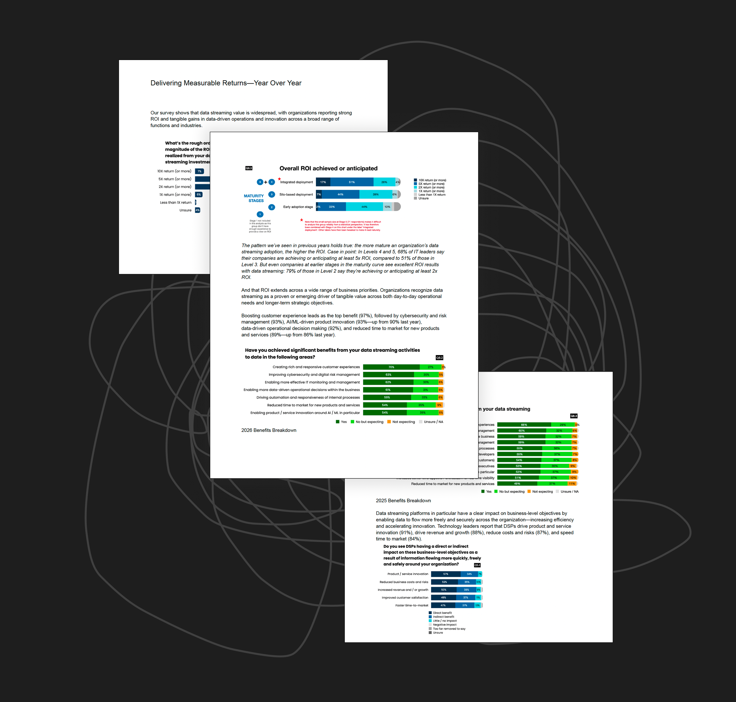
FROM RAW DATA MESS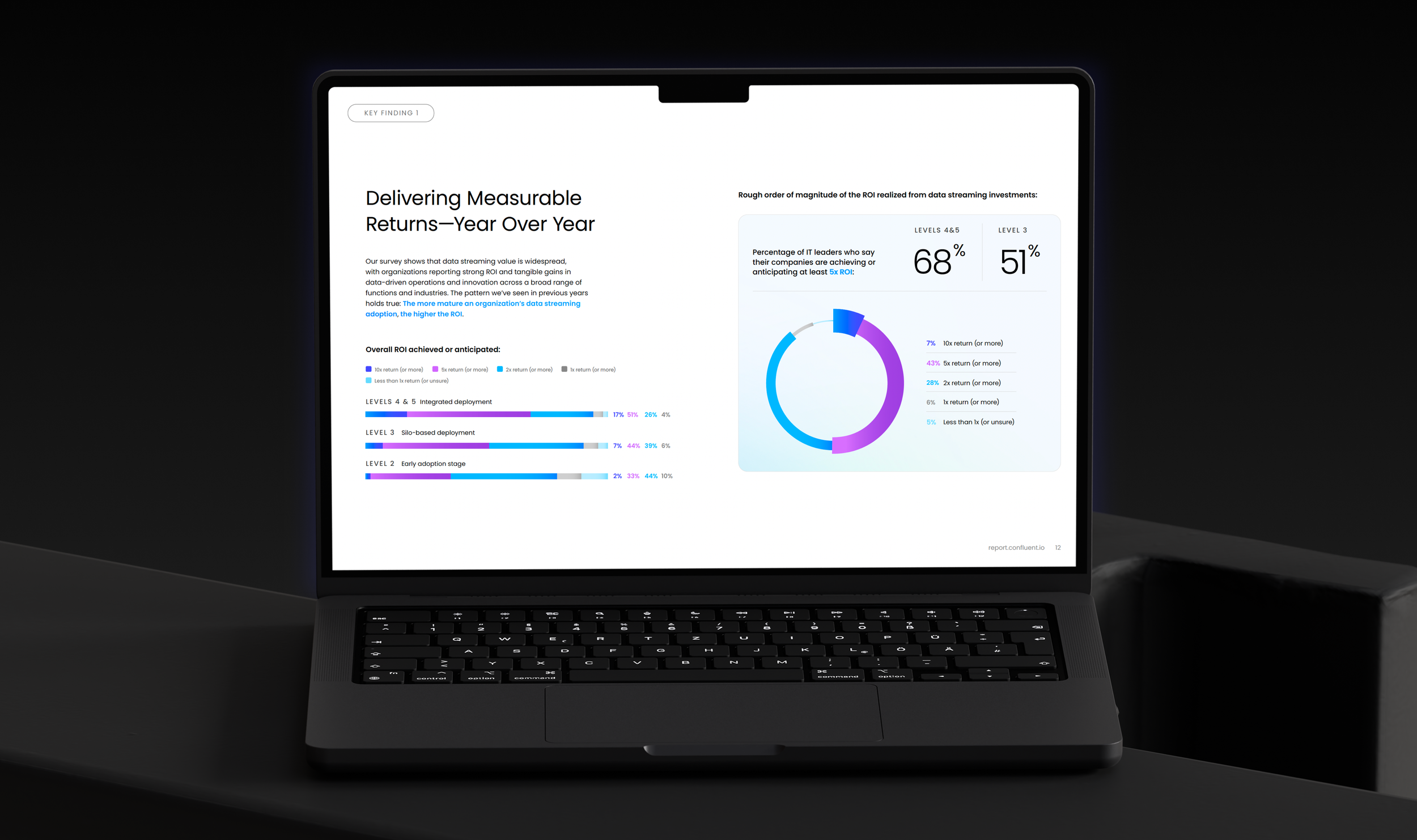
TO CLEAR KEY FINDINGSSocial

key metrics for engagement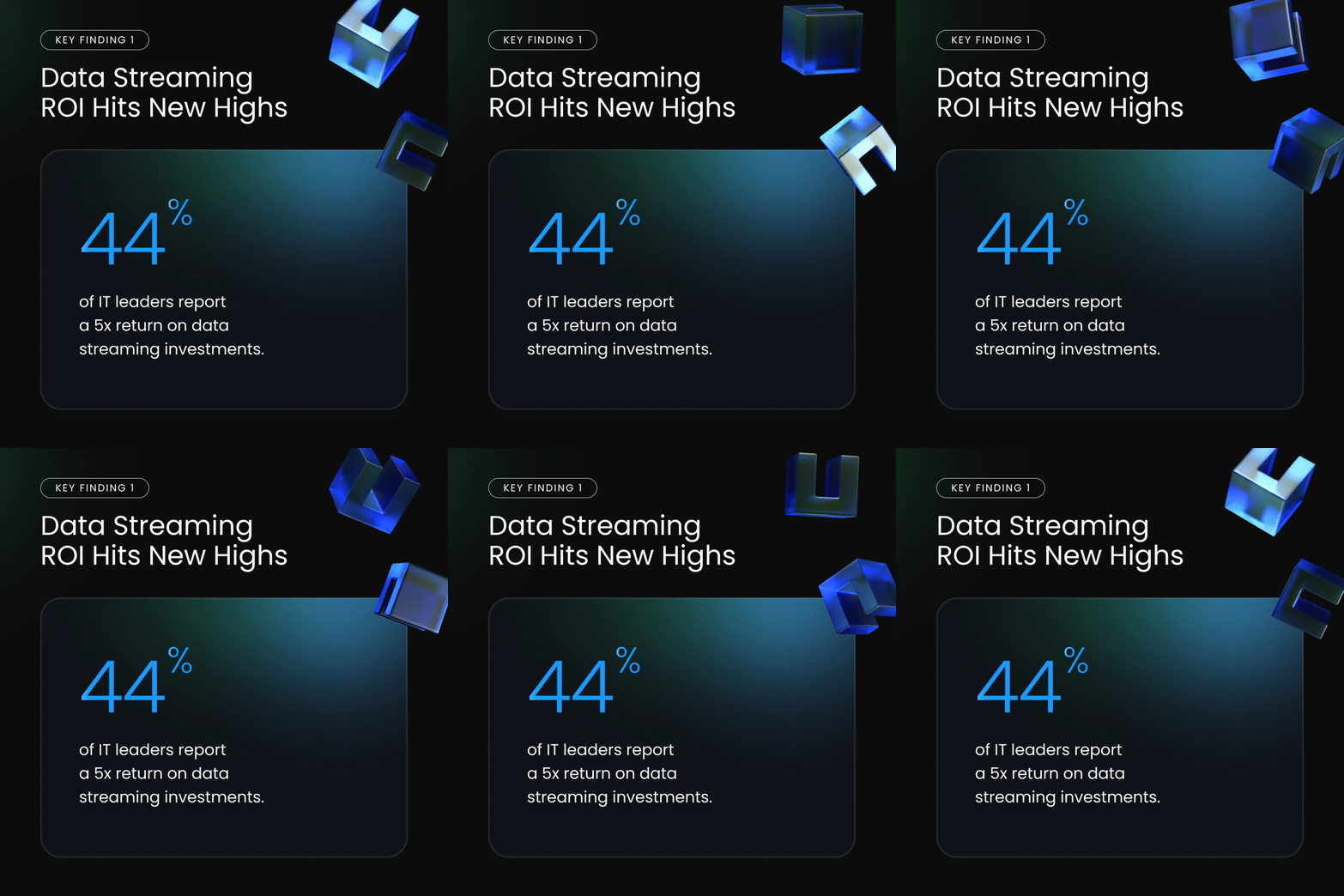

TEASER POCKET GUIDEart direction : george barros
visual design lead : Delaney pratt-fitzgerald
motion design : nick bizzack
web design : jeremy snyder
CONTENT MANAGER : MEKHALA ROY