Fresh identity for an EV startup
BRAND IDENTITY • UI DESIGN Revo is an online platform that helps people find the perfect EV for them through detailed product pages and educational content.
My goal for this project was to create a distinctive identity (logo, style guide, landing page and overall UI design) that separated them from their “cold and broey” competitors and was exciting to a wide audience.

Brand Identity & Design System
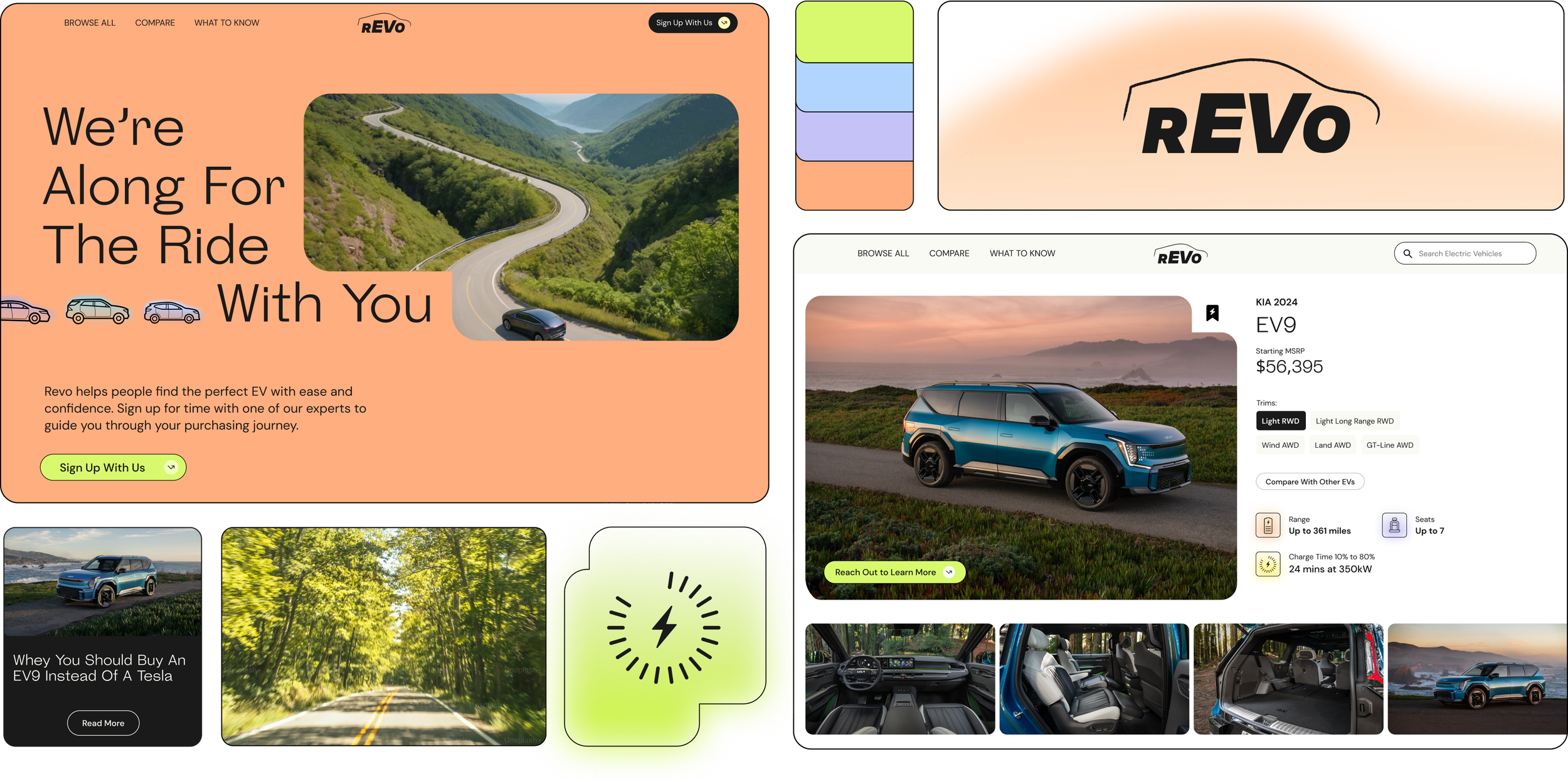
The client wanted Revo to feel more like a “wise friend” than an OEM dealer. I ditched the cold palettes, stock-y imagery and opted for brighter, softer gradients and graphic elements that could layer on top of each other, much like how you acquire information, gradually putting the pieces together.
WARM & WISE
Deciding which EV is right for you is a huge cognitive load—something Revo aims to alleviate by breaking down complex information into easily digestible bites. I brought type to the forefront of the design (by making it huge!) to drive home the short, snappy information.
GO BIG (TYPE) OR GO HOME
Many of the graphic elements reference back to cars and forward momentum but in their own fun way. Nods to engines in the form of containers, an abstract car shape for gradients, and a loose outline of a car driving forwards for the logo.
CARS, BUT MAKE IT SUBTLE
LOGO PROCESS
UI Design &
Landing Page
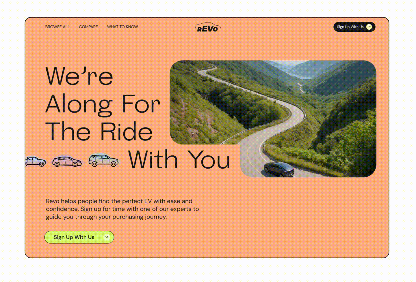
I designed the landing page to be bold, eye catching, and simple. You’re about to pick out a new car and save the planet! It should be fun! Layering the graphic elements and adding movement via simple animations brought the page to life.
LANDING PAGE
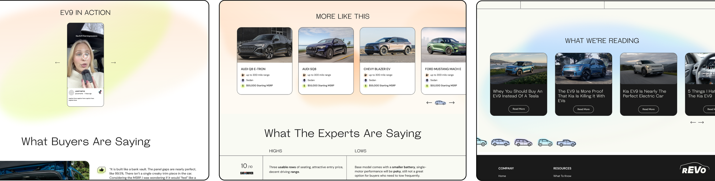
A lot of the OEM images aren’t usable (for formatting reasons, for favoring certain brands, etc), so I had to get creative. Using roads and movement to allude to cars instead of the big brands themselves. This is also where the large graphic library comes into play!
IMAGERY CHALLENGES
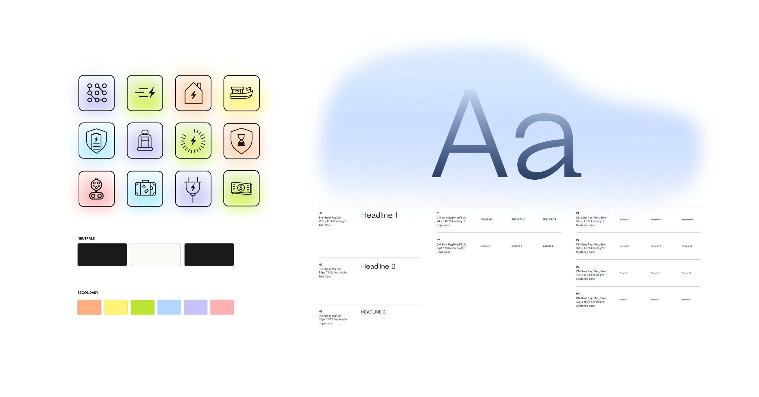
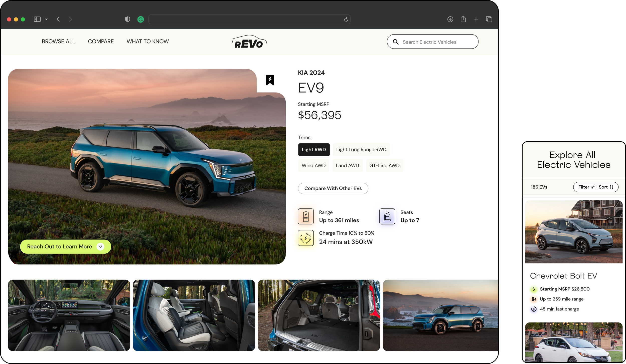
The challenge here was to keep the warmth of the brand while also keeping it simple. Showing the features in fun, varied iconography; adding in black strokes for structure amongst the gradients; typography hierarchy was very important here and leaned heavily on the design system.
PRODUCT PAGES
TEAM
brand & ui design : delaney pratt-fitzgerald
product design : greta harrison
product managers : nicole monterosso,  tapasya wancho